Mastering Modern CSS Layouts: Flexbox vs. CSS Grid Comparison Guide
A comprehensive guide on choosing between Flexbox and CSS Grid. Learn when to use one-dimensional or two-dimensional CSS layouts for modern, responsive web design.
Drake Nguyen
Founder · System Architect
Introduction to Modern CSS Layouts
Welcome to the ultimate front-end development guide for structuring web interfaces. If you want to build responsive, scalable, and visually compelling websites, mastering modern CSS layouts is absolutely non-negotiable. Gone are the days of hacking floats, relying heavily on clearfixes, or misusing HTML tables to format web pages. Today, understanding CSS3 fundamentals means adopting streamlined, highly efficient standards for managing elements on a screen.
Modern web development has introduced advanced modern CSS techniques that give developers unparalleled control over structural styling. As web standards evolve, the two heavyweights dominating the layout ecosystem are Flexbox and CSS Grid. By understanding how to leverage these powerful modules, you can build interfaces that fluidly adapt to any screen size, enhancing both the user experience and the maintainability of your code base.
Understanding Flexbox: The Power of One-Dimensional Layouts
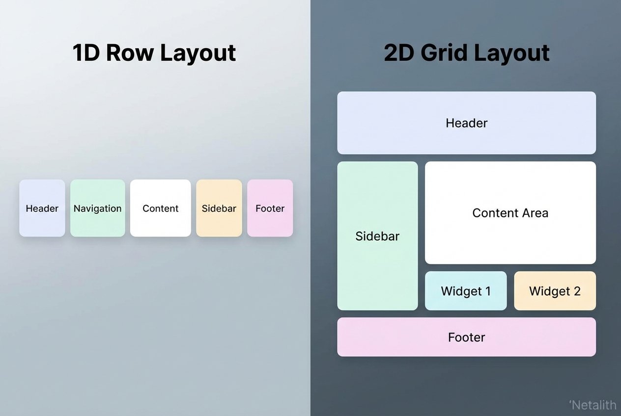
When evaluating the different CSS layout modules available to front-end developers, the Flexible Box Module—commonly known as Flexbox—stands out as an absolute game-changer. Flexbox was designed primarily for one-dimensional layouts. This means it is optimized for laying out elements in either a single row or a single column at a time.
Unlike older CSS positioning methods that required complex mathematical calculations or cumbersome floating elements, Flexbox operates dynamically. It excels at seamlessly aligning items and intelligently distributing space among items in a container, even when their sizes are unknown or dynamic.
Key Benefits of Flexbox
- Fluid Alignment: Easily center elements vertically and horizontally with properties like
justify-contentandalign-items. - Space Distribution: Properties such as
flex-grow,flex-shrink, andflex-basisallow elements to independently adapt their width and height. - Source Order Independence: You can change the visual order of elements using the
orderproperty without altering the underlying HTML structure.
"Flexbox revolutionized front-end development by making vertical centering and dynamic spacing intuitive and reliable, establishing itself as a core component of modern structural styling."
Exploring CSS Grid for Complex Two-Dimensional Layouts
While Flexbox is brilliant for linear arrangements, CSS Grid was engineered from the ground up to handle complex two-dimensional layouts. This means it allows developers to manipulate both rows and columns simultaneously, bringing an unprecedented level of control to modern page architecture.
CSS Grid transforms web page structures by applying robust layout algorithms to the grid container and its children. Instead of writing endless wrapper <div> tags to structure a dashboard or a photo gallery, you can define a strict or flexible grid system directly in your CSS.
Core Concepts of CSS Grid
- Grid Tracks: Defining rows and columns using properties like
grid-template-columnsandgrid-template-rows. - Fractional Units (fr): A highly flexible unit of measurement designed specifically for Grid to allocate available space proportionally.
- Grid Areas: The ability to name layout sections (like header, sidebar, main, footer) and map them visually in CSS using
grid-template-areas.
CSS Grid vs Flexbox: Differences in Modern CSS Layouts
The debate of CSS Grid vs Flexbox is common among beginner developers, but it is important to realize that they are designed to solve different problems. To get the CSS Grid and Flexbox differences explained simply: Flexbox is primarily content-first, while CSS Grid is layout-first.
In a standard CSS layouts comparison Flexbox vs Grid for beginners, you will find that with Flexbox, the size of the content often dictates how much space an element takes up within its one-dimensional axis. With Grid, the layout is defined first, and the content is placed into the explicitly sized two-dimensional grid cells.
Consider these key distinctions when comparing these CSS alignment systems:
- Dimension: Flexbox is strictly for one-dimensional layouts (a row or a column). Grid is for two-dimensional layouts (rows and columns together).
- Control: Flexbox offers deep control over the alignment and spacing of elements within a container. Grid offers rigid or fluid architectural constraints for the overall page wrapper.
- Overlap: CSS Grid makes overlapping elements remarkably simple by assigning them to the same grid cell, whereas Flexbox requires absolute positioning to achieve overlapping effects.
Choosing the Right CSS Layout Method for Your Project
Knowing exactly when to use CSS Grid vs Flexbox relies heavily on the specific component you are building. Choosing the right CSS layout method for your project means evaluating the design complexity and scale of the interface.
If you are building a navigation bar, a row of action buttons, or a simple card component where elements just need to push away from each other gracefully, Flexbox is your best option. However, if you are scaffolding the macro-layout of an entire application—such as a complex dashboard with a sticky header, a side navigation panel, and a massive data table—CSS Grid is significantly more efficient.
For a resilient responsive web design strategy, leverage both modern CSS techniques depending on the scope of the component. The best developers don't choose one over the other; they choose the right tool for the specific UI challenge.
Can You Combine Flexbox and Grid?
Absolutely. Combining both CSS layouts is highly recommended and considered a best practice in modern front-end architecture. The most scalable web interfaces use CSS Grid for the macro-level page structures and Flexbox for the micro-level alignment of elements inside the grid cells.
/* Example of Combining Both Layouts */
.page-container {
  display: grid;
  grid-template-columns: 250px 1fr;
  grid-template-rows: auto 1fr auto;
}

.navigation-bar {
  /* Living inside a Grid Cell, but acts as a Flex container */
  display: flex;
  justify-content: space-between;
  align-items: center;
}
Frequently Asked Questions
What is the main difference between Flexbox and CSS Grid?
The main difference lies in dimensionality. Flexbox handles one-dimensional layouts (either rows or columns), focusing on content size and alignment. CSS Grid handles two-dimensional layouts (both rows and columns simultaneously), focusing on the structural foundation of the page design.
Can I use Flexbox and CSS Grid together in the same web project?
Yes. It is standard practice to use both in the same project. You can nest a Flexbox container inside a CSS Grid item, or vice versa. Usually, Grid is used for page layout, and Flexbox is used for component alignment.
Which CSS layout method is better for responsive web design?
Neither is objectively "better" overall; they serve different purposes. CSS layouts built with Grid are excellent for responsive "skeletons," while Flexbox is better for responsive content that needs to wrap or stretch within a container. Most modern sites use a hybrid approach.
Conclusion: Mastering CSS Layouts
Mastering modern CSS layouts is an iterative process of learning when to provide structure and when to allow flexibility. By using a web layouts tutorial to practice both Flexbox and Grid, you will gain the skills necessary to build any UI mockup with precision and efficiency. Whether you are focusing on front-end layout methods for mobile apps or complex desktop dashboards, the combination of these two tools represents the gold standard of modern web development. Stay consistent, keep experimenting with structural styling, and watch your front-end capabilities reach new heights.