Mastering the CSS Box Model: A Guide to Margin, Padding, and Border-Box
Master the CSS box model with this guide. Learn about margin vs padding, border-box vs content-box, and how to control element dimensions for better web layouts.
Drake Nguyen
Founder · System Architect
If you have ever tried to position a button on a web page only to watch it inexplicably push everything else out of alignment, you have already collided with the unseen architecture of web design. Understanding this invisible structure is a rite of passage for every developer. At the very core of this structure lies the CSS box model. Whether you are arranging text, building a complex grid, or exploring HTML5 basics and CSS3 fundamentals, mastering this framework is essential for creating reliable, pixel-perfect layouts.
Every element you see on a web page is essentially a rectangular box. By learning how these boxes interact, you can stop guessing with web standards and start dictating exact web element spacing. In this comprehensive front-end development guide, we will break down exactly how this crucial layout physics system dictates everything from basic sizing to the intricacies of modern responsive web design.
What is the CSS Box Model?
To grasp the foundational principles of modern web design, you must first ask: what exactly is this concept? In simple terms, the CSS layout model is a conceptual container that wraps around every single HTML element. Whether you are dealing with block elements (like paragraphs and headers) that naturally take up the full width of their container, or inline elements (like links and spans) that flow alongside text, the browser treats them all as interactive boxes.
Having how the CSS layout model works explained clearly helps demystify unpredictable layouts. This underlying CSS layout model is responsible for calculating exactly how much space an element occupies on the screen and how it relates to the semantic HTML elements positioned around it.
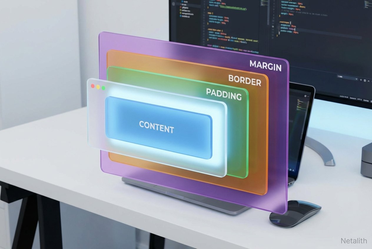
The Four Core Areas of the Box Model
To fully grasp layout physics, you need to dissect the CSS box properties. Every box consists of four distinct, concentric areas that control web element spacing:
- Content: The innermost area where text, images, or child elements actually live.
- Padding: The transparent space directly surrounding the content. Adjusting dimensions like padding-top and padding-bottom pushes the content away from its own borders.
- Border: A visible or invisible line that wraps around the padding and content.
- Margin: The outermost transparent space that separates the entire element from neighboring elements on the page.
Visualizing the CSS Box Model for Beginners
When you are just starting out, visualizing the CSS layout model for beginners can be challenging because padding and margins are inherently invisible. A great trick is to open your browser's Developer Tools (usually by pressing F12) and inspecting an element. You will see a color-coded diagram that acts as a visual box-sizing guide.
This diagnostic diagram represents effective white space management. Typically, the blue center is your content, green is padding, yellow is the border, and orange is the margin. By inspecting these layers, you can see in real-time how tweaking a single pixel of spacing ripples outward to alter your entire page structure using the CSS layout model.
Difference Between Margin and Padding in CSS
One of the most frequent hurdles for newcomers is understanding the difference between margin and padding in CSS. While both create empty space, they serve completely different structural purposes in your margin vs padding strategy.
Padding is internal space. It lives inside the element's border. If your element has a background color, the padding area will display that color. For example, increasing padding-top and padding-bottom on a button makes the button physically taller and thicker from the inside.
Margin, however, is external space. It lives outside the border and acts as a buffer zone between the current element and everything else. Margins are always transparent. You use margins to push other elements away, rather than expanding the footprint of the element itself.
Controlling Element Dimensions with the Box-Sizing Property
By default, CSS calculates element dimensions in a way that can be mathematically frustrating. If you set an element's width to 300px, but then add 20px of padding and a 2px border, the actual space the element takes up on screen becomes 344px. This default behavior can easily break carefully crafted CSS layouts.
Enter the box-sizing property. This magical line of code gives you the power to change how the browser calculates the total width and height of an element, ensuring your dimensions stay exactly where you set them without unexpected overflow.
Border-Box vs Content-Box Explained
The definitive solution to unpredictable widths lies in understanding border-box vs content-box.
box-sizing: content-box;: This is the default setting. Width and height only apply to the content area. Any padding or borders are added on top of the defined width, expanding the total size of the box.box-sizing: border-box;: This is the modern standard for predictable styling. When applied, the browser includes padding and borders within the width and height you specify. If you set a box to be 300px wide, it will never exceed 300px, regardless of how much padding you add; the internal content area just shrinks to accommodate it.
Pro Tip: Applying
box-sizing: border-box;globally to all elements using the universal selector is a highly recommended best practice in modern front-end development.
Common Spacing Pitfalls: Margin Collapse
Even seasoned developers occasionally battle with a quirk of web styling known as margin collapse. This phenomenon occurs when two vertical margins—such as the bottom margin of a heading and the top margin of a paragraph—touch each other. Instead of adding the two margins together, the browser combines them into a single margin equal to the size of the larger value.
For instance, if your top element has a 30px bottom margin and the bottom element has a 20px top margin, the total space between them won't be 50px; it will be 30px. Margin collapse exclusively affects vertical margins on block-level elements. Mastering this quirk is vital for maintaining precise element dimensions and executing flawless white space management without resorting to unnecessary hacky spacing solutions.
Conclusion: Mastering the CSS Box Model
Ultimately, getting a firm grip on the CSS layout model is what separates beginner tinkerers from confident front-end architects. By embracing and understanding the CSS layout model padding margin and border standards, you empower yourself to build interfaces that are robust, responsive, and incredibly reliable.
Remember that the CSS box model isn't just a theoretical concept—it is the very foundation of rendering on the web. From configuring the box-sizing property globally to navigating the nuances of vertical spacing, integrating these CSS3 fundamentals into your daily coding habits will profoundly improve your overall front-end development guide journey.
Frequently Asked Questions (FAQ
What is the CSS box model?
The CSS box model is a foundational rendering concept in web design where the browser treats every HTML element as a rectangular box. It consists of four distinct layers: content, padding, border, and margin.
When should I use margin vs padding?
Use padding when you want to create space inside an element (e.g., between the text and the border). Use margin when you want to create space between different elements on a page.
Why is box-sizing: border-box preferred?
Using border-box makes element dimensions much easier to manage because the padding and border are included in the width and height you specify, preventing layout breakage. In summary, a strong CSS box model strategy should stay useful long after publication.