CSS Flexbox Guide: Master One-Dimensional Layouts for Responsive Design
Master CSS Flexbox with this comprehensive guide for beginners. Learn about flex containers, alignment properties, and one-dimensional layout patterns.
Drake Nguyen
Founder · System Architect
Web development is constantly evolving, but mastering foundational layout tools remains absolutely critical. If you are stepping into front-end development, understanding CSS Flexbox is a non-negotiable skill. Traditionally, aligning elements on a web page meant wrestling with floats, margins, and complex table layouts. Today, modern CSS handles these challenges elegantly.
"flexible box layout revolutionized the way web developers construct dynamic interfaces, turning complex alignment nightmares into a few lines of readable code."
Whether you are a tech student, a cloud professional expanding your front-end skill set, or a junior developer, this article serves as your definitive guide to mastering component-level design. Let's explore how flexible box layout works, step-by-step.
What is CSS Flexbox?
For developers getting started with flexible box layout for one-dimensional layouts, now is the perfect time to build strong fundamentals. But what exactly is it? At its core, the flexible box module (or simply Flexbox) was designed to lay out, align, and distribute space among items within a container, even when their sizes are unknown or dynamic.
Unlike CSS Grid, which targets two-dimensional grids (rows and columns simultaneously), Flexbox focuses strictly on a one-dimensional CSS layout. It operates entirely on either a single row or a single column at a time. Mastering flexible box layout is one of the most critical flexbox basics every developer needs. By understanding this module, you are mastering the backbone of modern CSS layouts. Think of this section as your quick CSS flex guide to getting up to speed quickly.
Understanding Flex Container and Items
To fully learn flexbox best practices, you must first understand the fundamental relationship between the parent and child elements. Any flexible box layout requires two main components: the flex container and items.
When you apply display: flex; to an element, that element becomes the flex container. Instantly, all of its direct children become flex items. This relationship subtly changes how the browser interprets the CSS box model. Instead of stacking elements based strictly on block or inline rules, the flex container takes over the component-level layout, deciding how its children should flow, stretch, or align along its main axis.
Layout Alignment: justify-content and align-items
The true power of the flex container and items lies in layout alignment. The two most crucial tools at your disposal dictate spacing on the main axis and the cross axis.
- The justify-content property: This property manages how flex items align along the main axis (horizontally, by default). Whether you want items clustered at the start, centered, or evenly distributed (using
space-betweenorspace-around), the justify-content property handles the heavy lifting. - The align-items property: This handles alignment along the cross axis (vertically, by default). If you need your flex items to stretch to fill the container's height, or vertically align to the center, the align-items property is your go-to solution.
Mastering Item Sizing: flex-grow, flex-shrink, and flex-basis
Building adaptable, responsive components requires precise control over how individual elements scale. This is where the sizing properties come in.
The dynamic duo of flex-grow and flex-shrink controls how flex items behave when there is extra space, or a lack thereof. flex-grow dictates how much an item should stretch relative to its siblings, while flex-shrink determines how it should compress when the container gets too small.
To complete the triad, you need flex-basis explained: simply put, flex-basis establishes the default, initial size of a flex item before any growing or shrinking occurs. Setting flex: 1 1 200px; is shorthand for stating an item will grow, shrink, and start with a baseline width of 200 pixels.
Common Flexbox Alignment Patterns for Beginners
When reading any modern front-end development guide focused on responsive web design, you will repeatedly encounter specific layout strategies. Let's look at a few common flexbox alignment patterns for beginners.
While you might usually see flexbox properties explained with visual examples, professional workflows emphasize practical code demonstrations to teach CSS flex styling:
/* Pattern 1: Perfect Centering */
.center-container {
  display: flex;
  justify-content: center;
  align-items: center;
  height: 100vh;
}

/* Pattern 2: The Equal-Spacing Row */
.card-row {
  display: flex;
  justify-content: space-between;
  align-items: stretch;
}
By memorizing these snippets, you can effortlessly center content or space out product cards without relying on fragile margins.
Building a Responsive Navbar with CSS Flexbox Tutorial
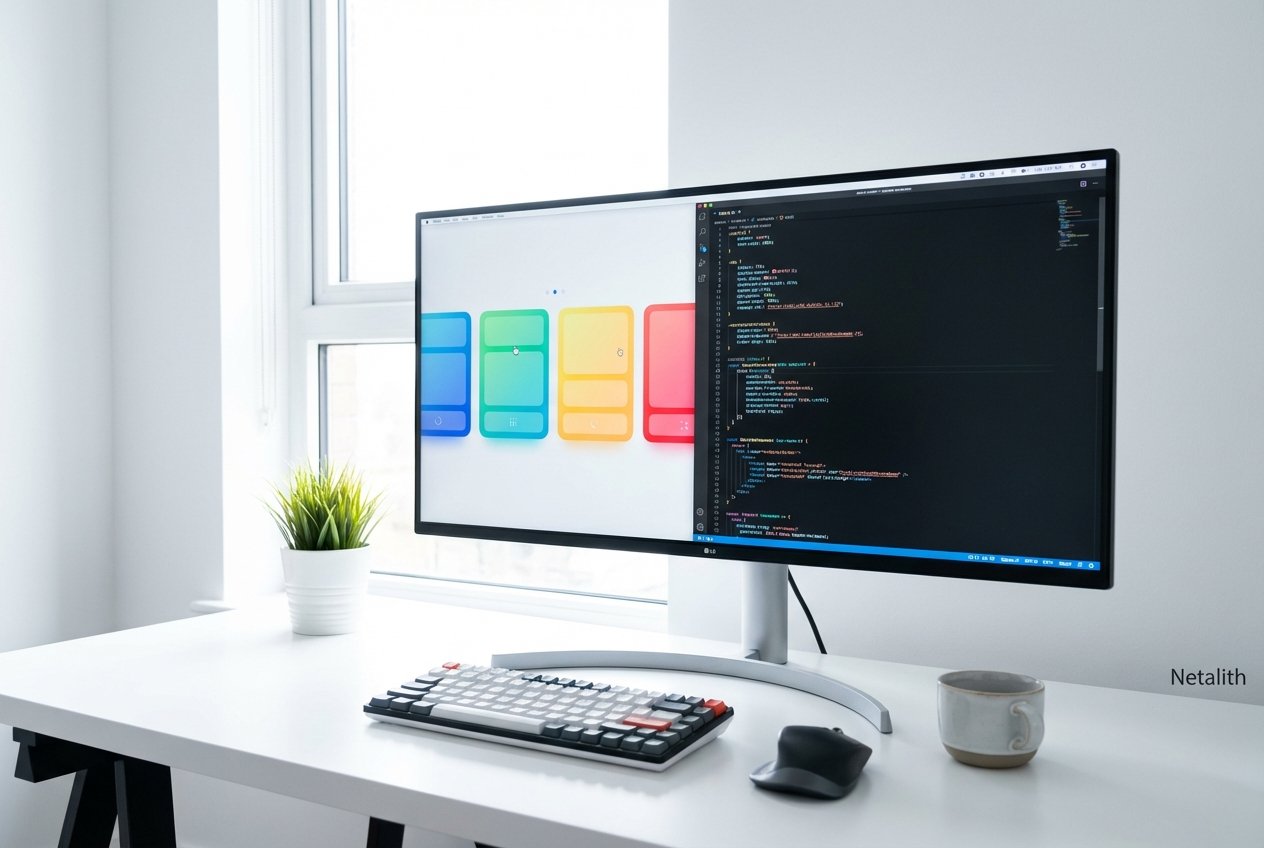
One of the most practical applications of flexible box layout is creating website navigation. Welcome to our building a responsive navbar with flexible box layout tutorial. By blending HTML5 basics with semantic HTML, we can create a robust navigation bar. Using CSS flex styling makes ensuring your responsive components look great on any screen size remarkably easy.
Here is the semantic HTML structure:
<nav class="navbar">
  <div class="logo">Netalith</div>
  <ul class="nav-links">
    <li><a href="#">Home</a></li>
    <li><a href="#">Features</a></li>
    <li><a href="#">Pricing</a></li>
  </ul>
</nav>
And the accompanying flexible box layout logic:
.navbar {
  display: flex;
  justify-content: space-between;
  align-items: center;
  padding: 1rem 2rem;
  background-color: #333;
  color: white;
}

.nav-links {
  display: flex;
  list-style: none;
  gap: 1.5rem;
}
In this example, the parent .navbar uses justify-content: space-between; to push the logo to the far left and the navigation links to the far right. The .nav-links list itself acts as a nested flex container to align the individual list items perfectly horizontally.
Frequently Asked Questions
What is the main difference between CSS Flexbox and CSS Grid?
The primary difference lies in their dimensions. CSS Flexbox is designed for one-dimensional layouts (a single row or a single column), making it perfect for component-level design like navigation bars and button groups. CSS Grid is intended for two-dimensional layouts, handling both rows and columns simultaneously for overall page structures.
How do I perfectly center a div using CSS Flexbox?
Perfectly centering a div is one of the most popular CSS Flexbox features. Simply apply display: flex; to the parent container, and add justify-content: center; (for horizontal alignment) and align-items: center; (for vertical alignment). Ensure the parent has a defined height, like 100vh.
Is CSS Flexbox fully supported in modern web browsers?
Yes, CSS Flexbox is globally supported across all modern desktop and mobile browsers. It has been a reliable web standard for years, meaning you can confidently use it in production environments without worrying about legacy browser compatibility.
Conclusion: Elevating Your Layouts with CSS Flexbox
We hope this comprehensive CSS flex guide has empowered you to build cleaner, more efficient layouts. Mastering CSS Flexbox is more than just learning a property; it is about adopting a modern mindset for web design where responsiveness and alignment are fluid rather than rigid. By practicing these flexbox basics and exploring more complex components, you will adhere to the highest web standards and ensure your front-end development skills remain top-tier.